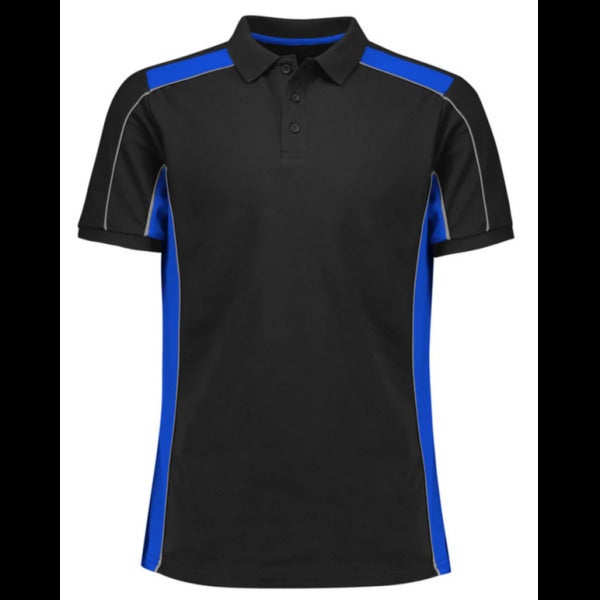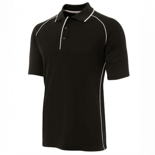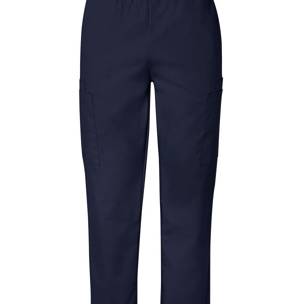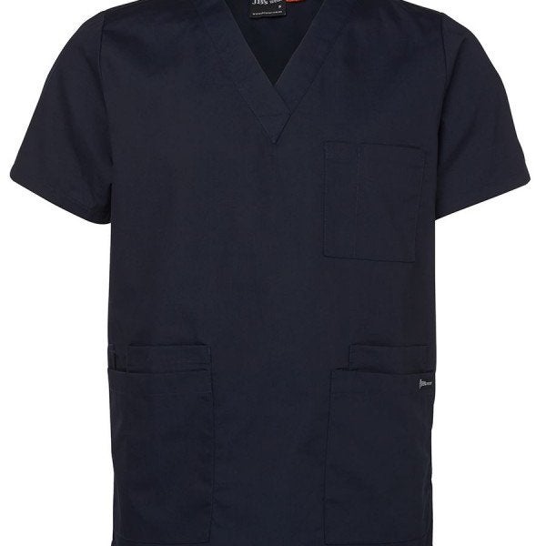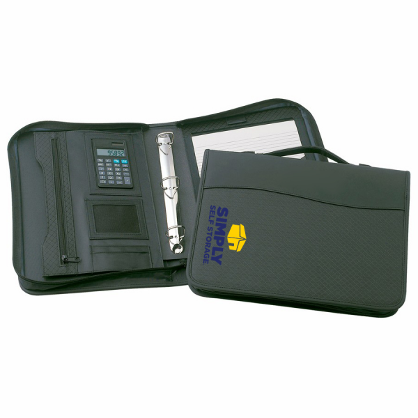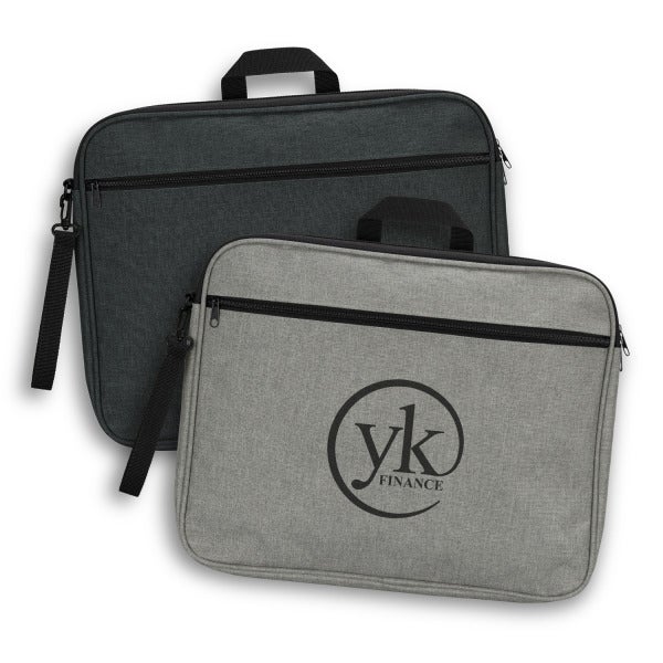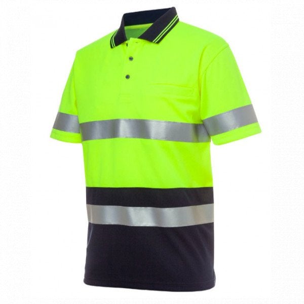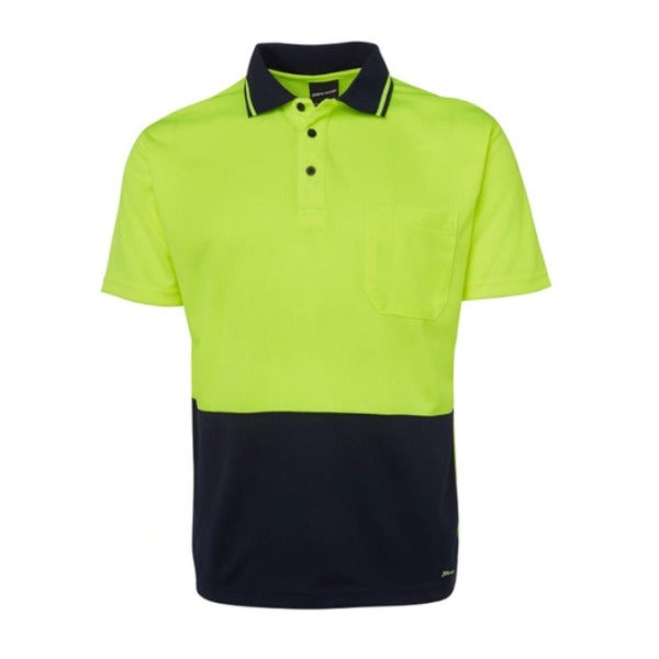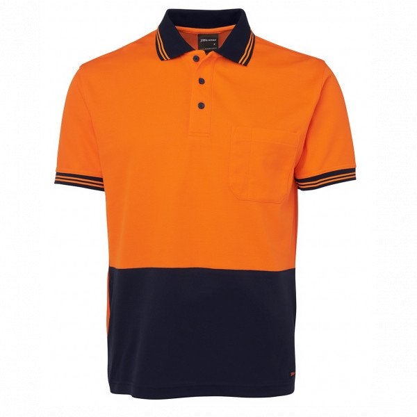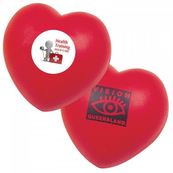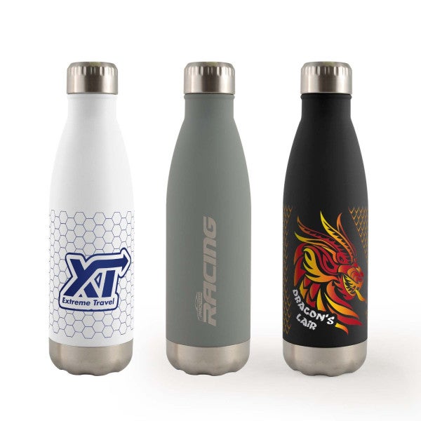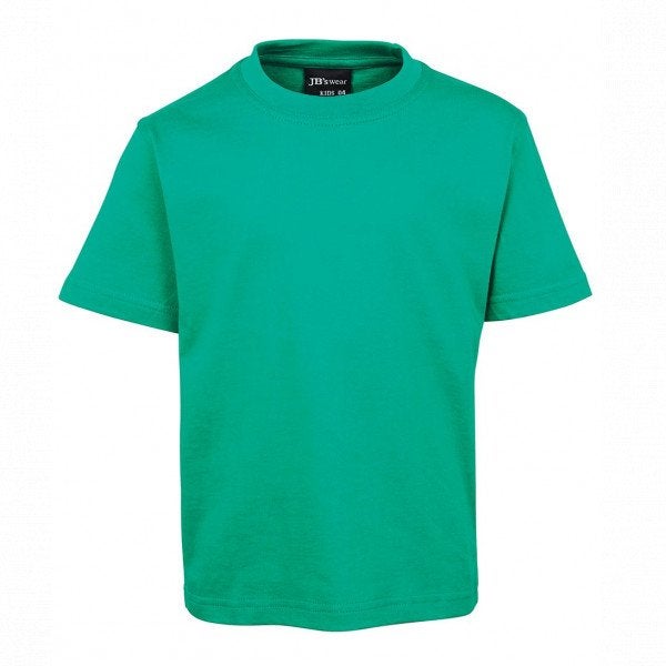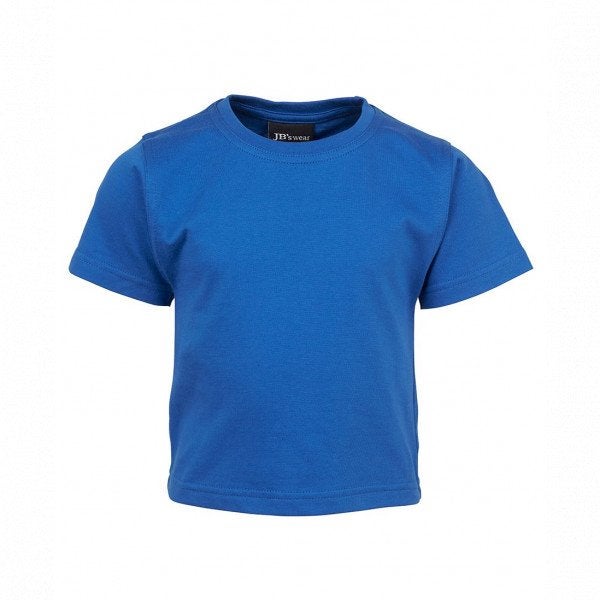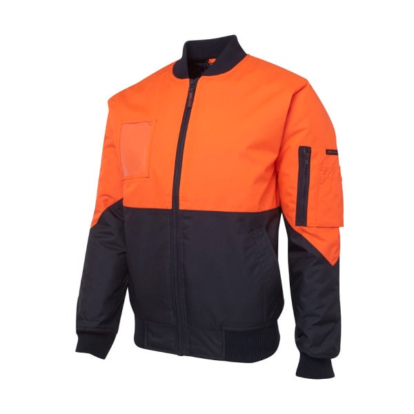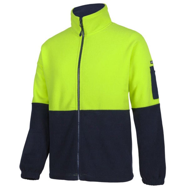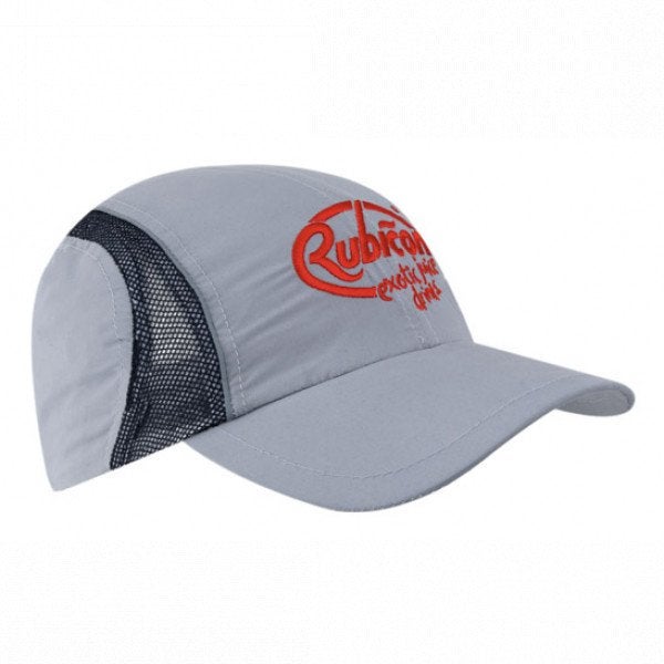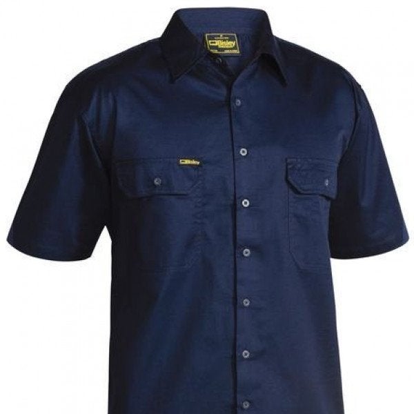
Your brand colours are one of the most recognisable things about your business. Customers register colour before they read a word. So when your navy polos, your printed signage and your promotional bottles are three slightly different shades of blue, it quietly undermines the professional image you are working to build.
Colour consistency across products is harder than most businesses expect, because colour behaves differently on different materials and in different processes. For businesses across Glen Waverley, Mount Waverley, Clayton, Mulgrave, Springvale and surrounding suburbs, here is how to keep your brand colours consistent everywhere they appear.
Why colour drifts across products
The same colour can look different on a cotton polo, an embroidered thread, a printed flyer and a plastic bottle. This is not carelessness, it is physics.
Screens display colour with light. Print uses ink on paper. Embroidery uses dyed thread. A promotional product might be moulded or coated plastic. Each medium reproduces colour in its own way, and a shade that looks right on one can look noticeably different on another. Left unmanaged, your brand ends up with a range of near-misses rather than one consistent colour.
The role of Pantone
The solution the industry relies on is the Pantone Matching System, usually just called Pantone. It is a standardised set of colours, each with a specific code, that acts as a shared reference across different materials and processes.
When you specify a Pantone code, you give every supplier and every process the same target to match to. Instead of asking for navy and hoping, you are asking for a specific, defined colour that can be matched as closely as each medium allows. It is the closest thing to a universal language for colour.
Know your brand colours
The first step is simply knowing your own colours precisely. Many businesses know their logo is blue but have never defined which blue.
What to document
Your brand colours should be documented as Pantone codes wherever possible, along with their equivalents for print and screen. If you have a brand style guide, this information is usually in it. If you do not, it is worth establishing these values once, because they become the reference for everything you order from that point on.
Having defined colours turns every future order from a guess into a specification.
Managing colour across methods
Even with a Pantone reference, each decoration method has its own considerations.
Embroidery
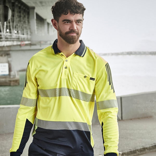
Thread comes in set colours, so your supplier matches your Pantone to the closest available thread. A good supplier will confirm the thread match before production, and once chosen, that thread is used on every future order for consistency.
Printing
Screen printing can mix ink to a Pantone match closely. Digital methods like DTG and sublimation reproduce colour slightly differently, so it is worth understanding that a digital print may vary marginally from a spot-colour print of the same code.
Promotional products
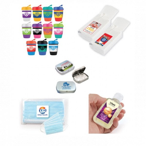
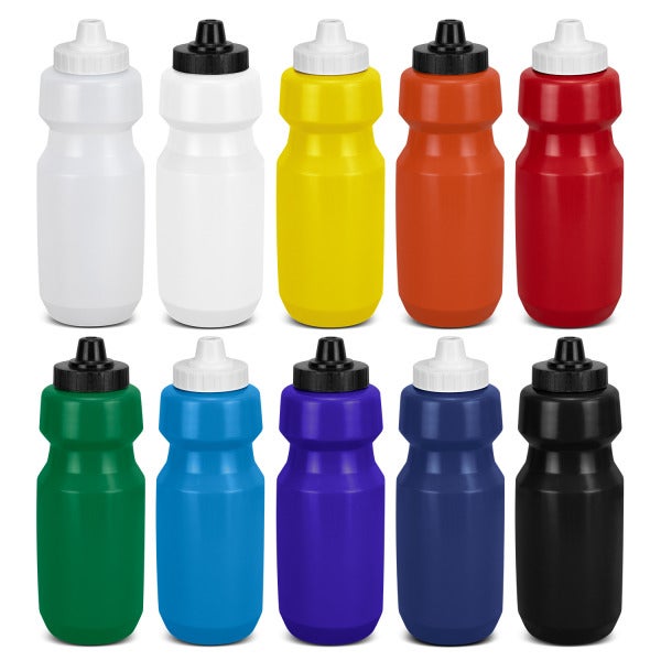
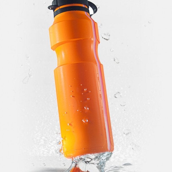
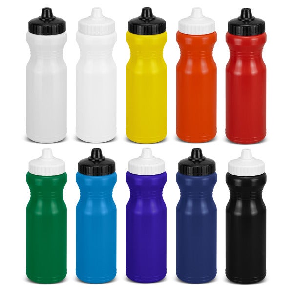
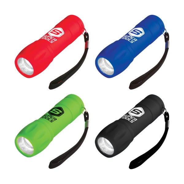
Branding on hard products, such as bottles and pens, is matched as closely as the product and process allow. Some materials and methods hold colour more precisely than others, which is worth discussing for colour-critical items.
The practical approach
Perfect, identical colour across every possible material is not always achievable, and it helps to understand that upfront. Thread, ink and plastic will never be pixel-identical. The realistic goal is close, controlled consistency, where every product is clearly the same brand colour rather than a visible mismatch.
You achieve this by defining your colours once, specifying them on every order, and working with a supplier who confirms matches before production rather than after. Consolidating your products through one supplier also helps, because they hold your colour references and apply them consistently across everything you order.
The impact of getting it right
Consistent colour is one of those things customers never consciously notice when it is right and always sense when it is wrong. A business whose uniforms, signage, print and promotional products all sit in the same controlled palette looks organised, established and professional. That impression is worth protecting.
Keep your brand colours consistent
If you want your brand colours matched consistently across apparel, print and promotional products, we can work from your Pantone references and confirm matches before production. Call Fully Promoted Mount Waverley on (03) 8566 8480 or request a quote through our website.
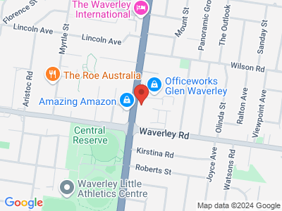
Fully Promoted Mount Waverley
1/350 Springvale Rd
Glen Waverley Victoria 3150




Create exactly the look you want with a variety of branding options. Our experts can help you discover which techniques will best represent your brand and your budget.
Whether it’s embroidery for your garments, screen printing for a run of apparel, or the latest in branding technology with direct to transfer printing, Fully Promoted has you covered.
Contact Fully Promoted today.


















Join our winning team and own your future with
Fully Promoted - the largest promotional franchise
in Australia.
Apply Today!
>



 Industries